Boston MFA Opens Art of Americas New Wing
New Inviting Space Frames Vast Collection
By: Mark Favermann - Nov 15, 2010
For well over a decade, the Art of Americas Wing of the Boston Museum of Fine Arts (aka East Wing) has been in the planning, design and finally construction phases of completion. With leadership from MFA Director Malcolm Rogers, the huge task was created by the distinguished London-based firm of Lord Norman Foster's Foster+Partners, the prolific and renowned international firm of architects.
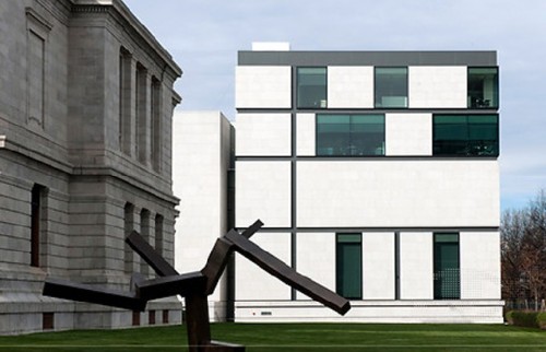
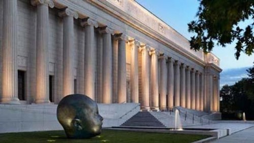
The results havebeen an elegant, stunning rather massive addition to the venerable MFA building originally designed by the architect Guy Lowell in 1907 and opened in 1909 on Boston's Huntington Avenue. This is only part of the MFA's Master Plan.
The best of present day museums are about visitor appeal and accessibility balanced with the highest levels of scholarship and curatorial quality. This is what the new Art of the Americas Wing at the MFA underscores. Coupled with the comprehensive collections of the museum, the MFA's new wing is a metaphor for the institution itself. Not only is the new building addition a symbol of perception, but it is a physical impetus for the way the staff works and the way visitors view art.
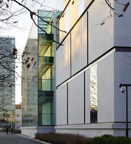
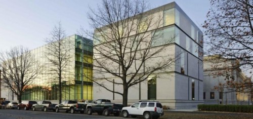
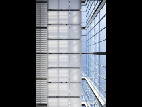
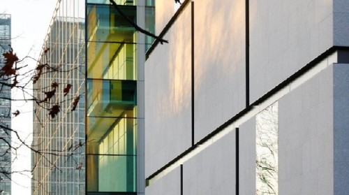
Starting on the outside, Lord Foster and his staff wanted to honor the Guy Lowell structure, not overwhelm it. Their approach was to create a new addition that was contemporary but restrained. Though not at all ghost-like, the Art of the Americas Wing clad in thin steel siding and glass is partially translucent as well as partially transparent.
The new wing does not call attention to itself. It has little real distinct character except being modern. This makes the simplicity of the minimalist glass and metal structural design work a contemporary counterpoint to the detailed Guy Lowell ornate Beaux Arts building.
Unlike many, even most new museum structures and additions, this new MFA wing is about looking at art rather than the architecture as dominant art piece. Foster+Partners were particularly conscious of this in their design. Instead of enclosing the museum, the new wing exposes the light, activity and art of the new wing. This is subtle yet thoughtfully strategic. It is strategically similar to a couple of years ago when the Fenway Entrance was reconfigured and reopened to once again connect the MFA to the Emerald Necklace.
This Fenway entrance made the MFA a part of the landscape rather than an institutional structure perched on it. The "new" north entry point established an enhanced accessibility to the great collections and better directional cues to find galleries and spaces. It was underscored by the Jean and Frederic Scharf Information Center along a central axis allowing for a 21st Century interactive introduction to the museum at the heart of the building. This gives visitors a better sense of where they are in the building. The visitors' orientation was previously confused when the entrance was through the I.M. Pei West Wing. The interior spaces gave no sense of internal location. Now this has been corrected. Major wayfinding has been reinforced by curators putting major works of art at ends of corridors and gallery spaces.
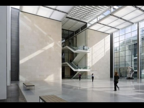
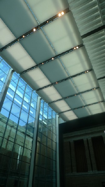
The Art of the Americas Wing is introduced by the grand yet surprisingly empty Shapiro Family Courtyard that flows off of the north-south corridor bisecting the building. The massive glass walled and roofed space seems perfect for public events, lectures and perhaps afternoon refreshment. Foster and the MFA view this as sort of a cultural town square.
The glass walls both reflect and allow views of the museum and its setting. It will be interesting to see how this space is actually used in the future. Maybe, more monumental art will be placed there to enhance a sense of scale in the three story high space?
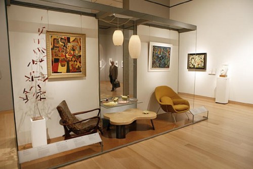
At the entrance to the new wing's 53 galleries, there is a contemporary processional staircase. Elegantly wrought, these stairs are similar to many other major museums large monumental staircases that seem to disregard aging populations. Each of the four floors of galleries is separated into a distinct period of Art of the Americas' works ranging over 3000 years and two continents. Just as the art differs, the galleries reflect differences and focus as well through the sensitive use of construction materials, spatial relationships and lighting.
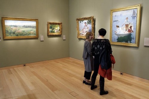
Though most of the galleries are spatially fine. The localized wayfinding seems limited, not directing visitors to the various nooks and crannies of the exhibition rooms. There is also a segmentation between the Art of the Americas space and the rest of the museum, not a clear and smooth flow. However, the galleries themselves are human scaled and comfortable as well as sometimes intimate while at other times grand. This is great museum design.
A few statistics put the scale of the project in perspective. The project expansion and renovation cost $345 million. The Guy Lowell/I.M. Pei (West Wing) building has been added to by 27% overall. Over 5000 objects are now on view, twice the number shown previously. The 49 new galleries and four new educational rooms are concentrated in one place.
Now with the addition of the Art of the Americas Wing, the Master Plan is being more clearly fleshed out. Phase 2 will be next year's reconfiguration of the West Wing (1981) of the museum. This will focus upon contemporary art and conservation. Several galleries will be reconstituted for contemporary art collection as well as temporary exhibits. The Conservation Department will be enclosed in glass and allow visitors to watch preservation and conservation processes. Again, the theme of greater transparency is being reinforced.
When completed next year, the whole MFA will be much more user friendly, accessible and educational. The wealth of objects and paintings so long hidden away will be exhibited more in a rotating fashion and in better scaled, lit and explained spaces.
Though not without a few flaws--like too many stairs, disconnection from other museum departments and perhaps a too subtle and not distinctive enough exterior facade, in the most human of terms, the new Art of the Americas Wing is a magnificent new addition to the venerable high culture Dowager on the Fenway, the Boston Museum of Fine Arts. Bravo, MFA.
