Museum of Arts and Design at 2 Columbus Circle
Controversial NYC Building Renovated
By: Mark Favermann - Nov 08, 2008
Considered by many to be the country's leading cultural institution dedicated to exploring the creative processes of contemporary craft artists, studio furniture makers and jewelry and other object designers from around the world, The Museum of Arts & Design has a distinguished permanent collection of over 2,000 objects. The museum was founded in 1956 by philanthropist Aileen Osborn Webb, as the Museum of Contemporary Crafts.
Known to challenge the boundaries that have traditionally separated fine art, craft, decorative arts, and design, since 1986, it was formally housed in a limited space across the street from the Museum of Modern Art (MOMA) at 40 53rd Street in Manhattan.
A new much larger building allows the museum to dramatically increase its range of offerings including expanded exhibition programming, artists-in-residence, and publicly accessible study collections. But the journey from 53rd Street to 2 Columbus Circle is a twisting story of a building that went from being celebrated to vilified, disused and vacant, to renewed, vilified once again and functional. Historically, 2 Columbus Circle is interesting.
In 1874, John D. Voorhis, a carriage maker, built the seven-story Pabst Grand Circle Hotel on an irregular plot. The hotel was designed by architect William H. Cauvet. It was made of brownstone with a mansard roof. In 1913, a group of actors gathered at the site and voted to form a union, the Actors' Equity Association. Eventually, the hotel was torn down, and, in 1964, a building at 2 Columbus Circle, designed by architect Edward Durell Stone, opened as the Gallery of Modern Art. The building housed the collection of Huntington Hartford, heir to the founder of A&P Supermarkets.
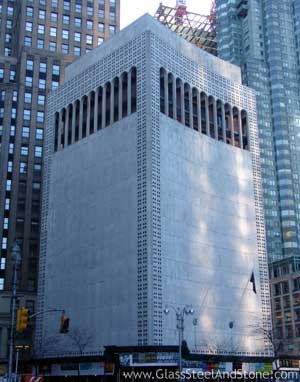
From 1964 to 2005 the site contained a 12 story, modernist structure by Edward Durell Stone. As Stone designed the building, it was marble-clad with ornate Venetian motifs and a distinctive curved façade with filigree-like portholes and windows that ran along an upper loggia at its top stories. The structure was called "The Lollipop Building," This was in reference to an unfavorable review by former New York Times architecture critic Ada Louise Huxtable, She had called Stone's building a "die-cut Venetian palazzo on lollipops." From the time it was built the façade was criticized as being too ornate and tasteless. Modernists felt it was not minimalist enough, and it expressed a style that was outdated, rather gauche and unchic.
The building design was a concave upright rectangle. Some compared it to a giant stone juice box with the juice sucked out. In its original design, the building's edges were perforated by double rows of round holes arranged in squares of four. At its top was a series of double volume arches. These added to the verticality of this building. It was a unique structure with much controversy and conversation attached to it. Was it a vestige of the 50's, a stylistic reaction to the International Style, or an eccentric architect/patron statement? Perhaps, it was a bit of all three. Many sophisticated people laughed at it or just tried to ignore it for its pomposity.
However, three decades later Huxtable and others who had maligned the structure began to see it as a distinctive period piece. Huxtable actually admitted enjoying to look at the building when she walked past it. It should be remembered that Stone had previously designed the Museum of Modern Art for the Rockefeller Family in the International Style. Huntington Hartford wanted his "Gallery of Modern Art" to represent an alternative view of contemporary design from MOMA's modernism.
In 1969, The Gallery of Modern Art closed. Fairleigh Dickinson University was given 2 Columbus Circle as a gift from Hartford. The university operated it as the New York Cultural Center. Art exhibitions were displayed there. During 1975, Gulf and Western Industries purchased the building, and in exchange for Tax Breaks, then Chairman and Bostonian, Sumner Redstone, agrees that the 2 Columbus Circle building can never be altered or removed. The building went unused until 1980. Then, Gulf and Western presented 2 Columbus Circle to the City of New York which installed there the headquarters for the Department of Cultural Affairs. The New York Convention and Visitors Bureau was also housed at 2 Columbus Circle. In 1998, The Department of Cultural Affairs, and the Convention and Visitors Bureau, vacated 2 Columbus Circle. It remained empty for several years.
Previously, in 1996, a request was made to the New York Landmarks Commission for a hearing to review the building. It was turned down. Again, in 2002, the landmark's Commission's Designation Committee reviewed the request to hold a hearing and again voted "No." Soon after this, in June 2002, the Museum of Arts & Design (MAD) was designated as the site developer of 2 Columbus Circle by the NYC Economic Development Corporation. Three years later, in June 2005, The NYC Department of Buildings approved the permit for the Museum of Arts & Design to remove 2 Columbus Circle's Edward Durell Stone distinctive facade.
Soon after the building turned thirty in 1996 and became eligible for landmark designation, there was interest in landmarking this building. In that year, in a piece for the New York Times, noted architect Robert A. M. Stern, Dean of Yale's School of Architecture, included 2 Columbus Circle in " A Preservationist's List of 35 Modern Landmarks-in-Waiting." Stone's design at 2 Columbus Circle was also listed as one of the World Monuments Fund's "100 Most Endangered Sites for 2006." In 2004, the National Trust for Historic Preservation included it as one of America's 11 Most Endangered Historic Places.
Proposed changes to the existing building touched off a preservation debate that included author Tom Wolfe, artists Chuck Close and Frank Stella, architect/critic Robert A. M. Stern, NY Times architectural critics Herbert Muschamp and Nicolai Ouroussoff, urban designer Witold Rybczynski and Congresswoman Carolyn Maloney (D-NY). Stone's building was considered worthy of preservation by the Historic Districts Council, the Municipal Art Society, The National Trust for Historic Preservation, the New York Landmarks Conservancy, the Preservation League of New York State, and the World Monuments Fund. All to no avail. The New York City Landsmarks Commission refused to hold hearings on the 1964 building or its purposed façade "improvement."
In order to create a new building façade for 2 Columbus Circle, the museum held a competition. The Museum of Arts and Design sought an architect whose design approach related to the institution's mission dedicated to the transformation of materials and the process of making objects. Eleven architectural firms were invited to develop design proposals for the project. The four finalists all brought their own understanding of craft to the project. Allied Works Architecture, led by Brad Cloepfil, was chosen for the project. This is this firm's first major commission in New York City.
The other finalists included Smith-Miller + Hawkinson Architects (New York, NY), Toshiko Mori Architect and James Carpenter Design Associates (New York, NY), and Zaha Hadid (London, England). Firms that did not make the finals included Kennedy Violich Architecture (Boston, MA), Koning Eizenberg Architecture (Santa Monica, CA), Lake/Flato Architects, Inc. (San Antonio, TX), Office dA (Boston, MA), Peter Marino and Associates Architects (New York, NY), Wendy Evans Joseph Architecture (New York, NY) and Will Bruder Architects, Ltd. (Pheonix, AZ).
Costing $90 million, there is an upbeat quality to the building's exterior and interior space. The façade is clean if not bold. The new building increased the total museum area by three and doubled the gallery space at the 53rd Street location. The total area of the museum is 54,000 square feet with gallery space of 14,000 square feet. These include dedicated permanent collection galleries, expanded special exhibition gallery space, a resource center, and gallery for contemporary jewelry.
The education facilities are set in 4,400 square feet including space for master classes and workshops for students and families. There are three open studios for ongoing artist-in-residence programs. There is a renovated 150-seat auditorium and theater from the older Stone building along with a restaurant and lounge overlooking Central Park. The new and larger museum store is located in the lobby.
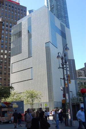
The architect's rehabilitation plan replaced the aging and neglected mechanical systems inside while, at the same time, giving the skin of the building a makeover. This was much to the horror of preservation groups. This new look is all about lines instead of holes. The lines are actually long windows allowing much more natural light into the interior spaces while taking advantage of the building's height and location to allow spectacular views of Central Park.
The skin of the building is made up of 22,000 terra cotta tiles coated with an iridescent glaze. This treatment allows the building to display pink and purple coloration across its face as the sun moves through the sky. The tiles are said to be symbolic because so much of the museum's collection is made up of glass and ceramic objects.
The facade is rather urban neutral. An interior negative is that the stairwells are narrow and difficult to walk down. Seniors and individuals with slight disabilities may have trouble with them. The walls are primarily bright white and are a bit overbearing and glaring. With time, perhaps, the walls will be toned down. It is hard to figure out what to do with the stairs to improve them, however. Perhaps, wait to take slow elevators?
Not surprisingly, many of the same people who were against the renovation of Edward Durell Stones building in the first place dislike, hate, even disparage the Allied Works firm's results. Some feel that this was an atrocious betrayal of the public trust. Others felt that this is a form of censorship that cleanses history and only allows for a prescribed view of the past (Nicolai Ouroussoff ). James Gardner, architecture critic for the New York Sun wrote, "Say what you want about Stone's building, it was indubitably a landmark; the best that can be said for its replacement is that, if we're lucky, no one will ever notice it..
The New Yorker's Paul Goldberger praised the new building's "functional, logical, and pleasant" interior, but chided, "Ultimately, Cloepfil has been trapped between paying homage to a legendary building and making something of his own. As a result, if you knew the old building, it is nearly impossible to get it out of your mind when you look at the new one. And, if you've never seen Columbus Circle before, you probably won't be satisfied, either: the building's proportions and composition seem just as odd and awkward as they ever did."
The moral here, if there is a moral, is that sometimes it is better to leave some things well enough alone. Façade apart, it can only be hoped that the Museum of Arts and Design flourishes at 2 Columbus Circle.


