Linde Family Wing for Contemporary Art
Museum of Fine Arts Creates Contemporary Home
By: Mark Favermann - Sep 17, 2011
Criticized for generations for not appropriately recognizing contemporary art either by properly collecting it or showing it in depth and in meaningful ways, this fall the Boston Museum of Fine Arts has made a major effort to make amends.
Over the week-end of September 16-18, 2011, the Linde Family Wing for Contemporary Art was unveiled. The result is a rather wonderfully inviting environment to view art, socialize and learn.
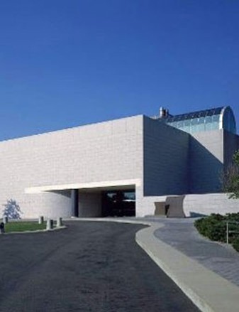
Comprised of more than 80,000 square feet, the new Linde Family Wing for Contemporary Art is located in the west-facing I.M. Pei-designed building, formerly referred to as the MFA's West Wing, that opened to much fanfare in 1981. In conservative Boston, Pei's West Wing was criticized by more than some as being more like a shopping mall than a great museum space.
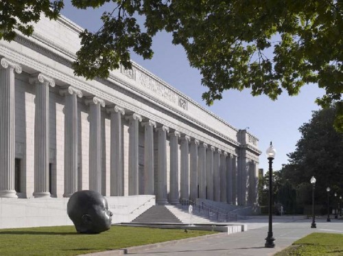
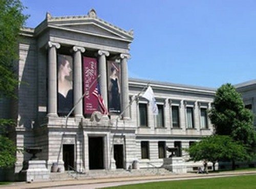
Yet, the West Wing was a great addition and a well-used departure for the venerable encyclopedic museum. It brought the Boston Museum of Fine Arts into the late 20th Century away from its architect Guy Lowell's more traditionally neoclassic megastructure built from 1909 to 1915.
The West Wing with its faults said "new" while the older MFA structure remained "old." With focus on it as the main museum entrance on the side of the museum rather than the front of the museum, the traditional front door to the MFA was closed.
In recent years, the Boston Museum of Fine Arts' circulation has now been revitalized. The traditional Huntington Avenue entrance and a ceremonial entrance along the Fens were reopened and opened a couple of years ago to community applause.
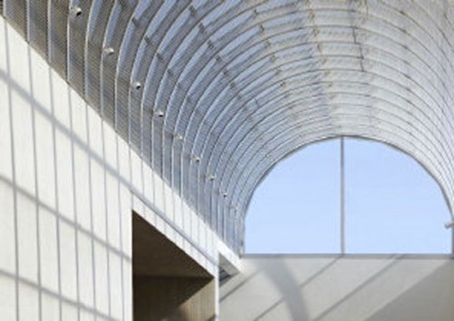
This new Linde Family Wing is not a new structure but instead a thoughtful renovation. A bright barrel-vaulted skylight runs the length of the win. Barely noticed in recent years, the 1981 skylight was carefully and completely cleaned. It provides natural illumination throughout the building’s two main levels. Better lighting adds to the visual clarity of the space.
The renovation of the wing has more than tripled the exhibition space. This has resulted in over 21,000 square feet of seven newly organized gallery spaces. It has also allowed for the creation of new and greatly enhanced education and social spaces.
Education is a feature of the newly completed space. Opportunities to learn about and interact with art are offered in the John, Bertram A. and Ronald M. Druker Family Pavilion. It includes two new classrooms totaling 2,100 square feet, a new entry to the Mabel Louise Riley Seminar Room, and redone Bookstore and Shop.
Films, lectures, and concerts will continue to take place in the 380-seat adjacent Remis Auditorium. Additionally, visitors can get something to eat or drink, relax and socialize in Taste, the new café and wine bar. This space features contemporary bar seating as well as comfortable lounge chairs set around coffee tables.
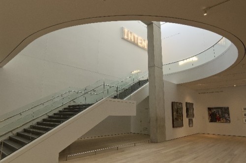
Other major enhancements in the Linde Family Wing include the increased elevation of the gallery ceilings, many 18 feet high to accommodate larger art works and other specific details that enhance the museum visit. Instead of the old terrazo flooring, more like a shopping mall than a museum, there is new oak flooring that softens the physical space.
The 30 year old escalator, another rather mall-like vestige, has been replaced by a new grand staircase. Staircases seem to be a major architectural feature of all new and renovated museums. Considering aging populations, this is a design feature that is not necessarily appropriate other than as a visual focal point. In fact, the overdone stairs at the former Museum of American Folk Art in NYC led to its demise.
In the three decades since the I.M. Pei archiects designed the West Wing's Gund and Foster Galleries, lighting fixtures and lighting techniques have greatly improved. In the Linde Family wing renovation, lighting, both natural and artificial, demonstrate this enhancement. For the museum visitor, the overall feeling is that spaces are both brighter and visually clearer. Contemporary art is now beautifully illuminated in the new spaces.
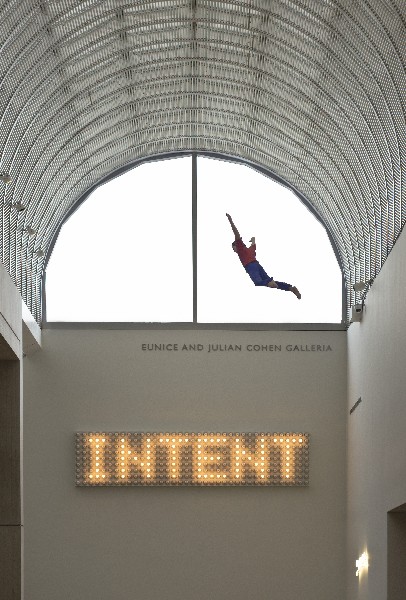
The central corridor of the new wing, the Eunice and Julian Cohen Galleria, is a long, open atrium. This high space is a clever gallery showcasing sculpture and light works. Its two levels also double as a social space including bookshop, cafe, restaurant, education center.
The former West Wing's earlier designed restrooms have been improved as well. The former West Wing's entrance has been transformed into the school and community group entry. This will welcome each year more than 100,000 students and community groups into the Museum.
Museum of Fine Art Director Malcolm Rogers led the renovation team. The design effort was directed by the MFA's Head Designer/Design Architect Keith Crippen. Architect Michael Jones, a partner at Foster + Partners (London), who was responsible for the detailed master plan of the MFA and design of the recently opened Art of the Americas Wing, developed the overall plan for the Linde Family Wing.
As Foster did with the Art of the Americas Wing, they continued to work with CBT/Childs Bertman Tseckares Inc. of Boston in the creation of the seven collection galleries. Retail architects Bergmeyer Associates, Inc., also of Boston, collaborated on the redesign of the retail and classroom spaces.
The Linde Family Wing for Contemporary Art is a high quality 21st Century cultural environment. Elegant but somehow warm as well as informal, unlike the hard surfaced former West Wing, this new contemporary wing will become a popular designation. It is bright and user-friendly. There is a comfort level here that did not exist in the old West Wing.
These new and enhanced spaces allow for a dialogue cleverly initiated between contemporary art and the MFA's encyclopedic collection (already demonstrated in its inaugeral exhibition) and a visual conversation between the visitor and the art. This is truly a 21st Century visual arts setting.
The museum's energetic curatorial team headed by Edward Saywell now has a platform, no a pedestal, and a jewel box writ large to present contemporary art, not as a museum afterthought but as specifically and thoughtfully a focus of prominent attention. Its damn good. And its about time.
Malcolm Rogers Interview
Bonetti Review of Linde Wing
Contemporary Art in Boston an Overview

