Letter from Berlin #3: Anish Kapoor
The Beautiful and the Sublime
By: Patricia Hills - Jul 08, 2013


Berlin is chock full of specialized museums of every type spread throughout the city. There is no one “universal” museum like the Metropolitan Museum of Art in New York that can claim to have all periods and styles of art from Oceanic masks and drums to contemporary sculpture.
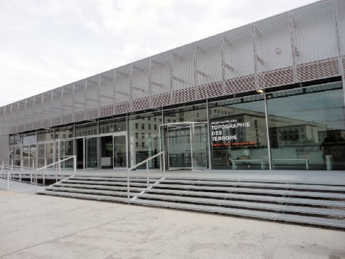
Sometimes the juxtapositions of the Berlin museums can be jarring. Take the case of two exhibition halls, a short walk from Potsdamer Platz. One is the Martin-Gropius-Bau, a huge blocky late 19th-century building in a Neo-Renaissance style, designed by Martin Gropius (uncle to Walter Gropius) and Heino Schmieden, that sits on Niederkirchnerstrasse, one of the former dividing lines between East and West Berlin. Next door, we find the compact modern, one-story exhibition hall and open-air exhibition that makes use of a long stretch of the WALL (the Maurer that divided Berlin between 1961 and 1989), designed by architect Ursula Wilms and landscape architect Heinz W. Hallmann. This complex, run by the Topography of Terror Foundation, opened on May 7, 2010, a not insignificant date, since May 7, 1945, was the date that the Germans signed the military surrender in Reims, France.
The Martin-Gropius-Bau, a space originally designed as a museum of applied arts, has today morphed into a Kunsthalle for temporary exhibitions of 20th-century and contemporary art. In contrast the Wilms/Hallmann complex offers a permanent exhibition, “Topography of Terror: Gestapo, SS, and Reich Security Main Office on Wilhelm- and Prinz-Albrecht-Strasse.” This documents through blow-ups of photographs, newspapers, journals, and official texts, those three agencies that terrorized the German population during the years of The Third Reich, 1933 to 1945 and controlled the concentration camps. The site is also significant, because the three agencies—SS, Gestapo, and Reich Security—all inhabited buildings at this location; what was not destroyed during World War II was knocked down by the Soviets in the post-war years. A lot of awful history transpired, thanks to Heinrich Himmler, the Reich SS Leader; Reinhard Heinrich, Himmler’s deputy in charge of the concentration camps; Hermann Göring, who formed the Gestapo (Secret State Police, “Geheime Staatspolizei”); Joseph Goebbels, the Propaganda Minister, and their ilk.
Best to tackle first the Martin-Gropius-Bau Museum. Art first, then history. But, really, first is lunch, which we had in the museum’s tree-shaded yard, serviced by waiters from the museum’s restaurant. My family had brautwurst, sauerkraut, and potato salad, while I had a spargel (the white asparagus that is a German culinary passion). As in the US, the best moderately priced lunches in a city are usually served at museum restaurants; and the ambience is guaranteed to be great. But on to the exhibitions.
Kapoor in Berlin (closing November 24) is a show I had looked forward to seeing, and it did not disappoint. Anish Kapoor (born 1954 in Mumbai; British citizen, recently knighted) creates massive sculptures from different materials that vary from forms that look like prehistoric rock formations, to highly reflective steel, to sticky red wax. Two years ago I was delightfully overwhelmed with his Cloud Gate, 2004-06, installed at the AT&T Plaza in Millennium Park in Chicago. Made of stainless steel with the sheen of liquid mercury, this 33 x 66 x 42 foot sculpture looks like a round convex pillow and attracts kids of all ages to walk through the passage (formed by “plumping the pillow”) and to see themselves distorted by the curving mirror surface—like a fun house effect.
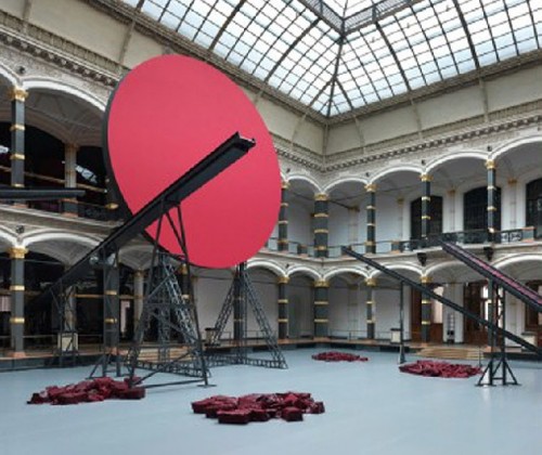
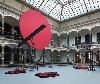
The basket-ball-court-sized atrium of the Martin-Gropius-Bau is filled with Kapoor’s installation consisting of large chunks of sticky red wax and conveyor belt machinery seemingly functioning to lift up the chunks of wax to be dropped again on the floor. Hard to interpret Kapoor’s intentions, since none of the machinery was operating, but the sheer largeness was impressive.
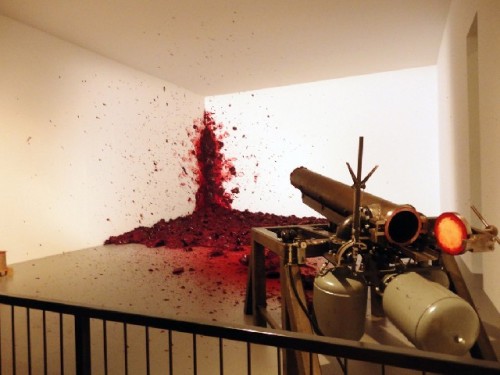
In another room the installation titled Shooting Into the Corner, 2008-09, consisted of a cannon that periodically shot shell-sized chunks of the red wax against one corner of the room. Visitors were offered noise-cancelling head phone to minimize the thundering thud of the cannon shot. Gimmicky? Or grim? The cannon suggested historical revolutions and wars; the splats of red on the corner walls recalled executions. The randomness of the timing of the cannon blasts asserted the arbitrariness of wars.
Although Kapoor works with generally abstract forms, the inclusion of functional artifacts and evocative titles hint at definite interpretations. Tutored as we have been by Joseph Beuys’s blocks of tallow and fat, we tend to see meaning in raw materials. In the case of Beuys’s tallow/fat, we conjure up the consequences of bloodless deaths in concentration camp gas chambers, whereas the magenta-red sticky wax of Kapoor suggests blood and violence. Defined as “wax and oil based paint,” it is decidedly sticky. I indulged my curiosity by thrusting my finger into an installation titled “Stuck” that consisted of a machine buried within a tower of red wax attached to a steel blade rotating around the wax and cutting and shaping the wax into the form of a huge (maybe 15 feet high) bell. I just touched the scrapings—left on the bottom rim as the blade slowly and continuously encircled the bell. No guard saw me, nor kids. I wouldn’t want to be a bad example of proper visitor behavior.
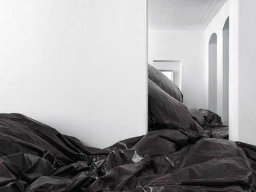
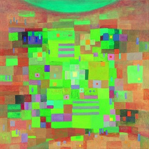
Large rooms surrounded the atrium that displayed some 70 examples of Kapoor’s sculpture made of stone, of stone and pigment, of fiberglass and pigment, of steel and paint, of highly polished steel, of concrete, of resin, of resin and dirt. One impressive room after another, each focused on a particular material, with lots of space to walk among the structures. Taking up the space of three galleries was The Death of Leviathan, 2011-13, made of huge sheets of brown-black PVC, pumped up like an inflatable dirigible in one room, snaking through the doorway to another room and ending up in the third room as a deflated flat surface covering the floor. One can well imagine a great whale beached on the shore and dying a slow death.
Apocalypse and the Millennium, 2013, made of resin and earth shaped into a honey-comb structure—but a dry dirt without organic nutrients and covered with a grey-brown hard particulates. It looked deathly, something from outer space, incapable of sustaining real life.
Splush and Splodge, both of 2012-13, were structures about 7 or 8 feet tall and made of small spirals of fine concrete piled one on top of another. I thought of clusters of pretzels looking like Meissen porcelain piled up into towers of large shapes. Gethsemane, 2013, made of red resin, suggested anatomical models of blood vessels—also very large. And Vertigo, 2006, looked like a small version of Richard Serra’s Tilted Arc, except Kapoor’s work, made of shiny stainless steel with the shimmer of mercury, have a European elegance and sophistication far removed from the industrial assertiveness of Serra’s work. Kapoor’s genius is in imparting to abstract forms something of the wit and anxiety of modern living.
Another floor of the Martin-Gropius-Bau held a retrospective exhibition (closing September 16) of the painter Horst Antes (born 1936), billed as one of the new figurative painters in Germany during the later post-war years. He trained in Karlsruhe and later taught art there. He became well known for his Kopffüssler (head-footer) figures. As I went through the chronology of the exhibition I saw Antes’s work becoming very expressionist, and then irritatingly mannerist, until the late 1990s and 2000s when he began to do simple house shapes on large canvases, for example Drei Häuser, 2010. Having seen such tall, unornamented houses that make up the small agricultural villages outside Berlin, I could appreciate more keenly their monumentality and serenity.
Other galleries were devoted to the exhibition Kosmos Farbe: Itten-Klee (closing July 29), a pairing of the work of Johannes Itten (1888-1967) with that of Paul Klee (1879-1940), both of whom taught at the Bauhaus and were interested in the expressiveness (Klee) and the science (Itten) of color. Klee, so the wall labels informed us, discovered color on a trip to Tunisia in 1914; at the Bauhaus from 1921, he went on to explore color theory. His work, as we all have come to expect, is delightfully whimsical with ranges of hues, tones, and gradations. He may have been knowledgeable about theory, but he still seems to have painted intuitively—more interested in the emotional effects of color.
Itten, on the other hand, seriously studied the physics of color and some of the philosophical and cosmological theories associated with color—those developed by Goethe, Adolf Holzel, and Philip Otto Runge. After about three years at the Bauhaus, Itten went to teach at the Stuttgart Academy. In 1963 he painted a series of four paintings on Spring, Summer, Autumn, Winter. One feels the warmth and chill of colors as the seasons pass. Years ago, I took a graduate design course with Richard Lippold at Hunter College. Our final assignment was to use the specific design each of us had worked with during the semester and make twelve paintings of morning, noon, and night of each of the four seasons. We learned that the emotional dimension of color, whatever the science, makes the art.
Itten’s work was an eye-opener with its color wheels and subtleties of the color spectrum incorporated into his work; Klee’s work took on new meanings when we focused on this context of color theory.
Gropius’s motto for the Bauhaus, again noted on a wall label, was to “train not just artists but a new kind of humanity.” The Nazis, as we know, closed down the Bauhaus; Gropius’s humanity had no place in the racist vision Hitler held for the Third Reich.
Leaving the Martin-Gropius-Bau and walking next door to the Topographies of Terror exhibition, we were plunged into a photographic history of the Nazi philosophy of the master race, the terror needed to maintain it, and the victims. The Nazis moved quickly to impose their racist views. Hitler was named Chancellor in March 1933, and in the next couple of months laws were enacted restricting Jews’ educational opportunities, professional access, and civil rights. People on the Left, homosexuals, liberal clergy, and the Roma (gypsies) fared no better.
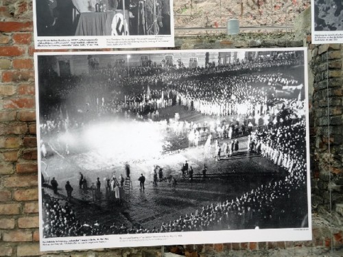
There were the book burnings begun when the new government, also coordinating with Nazi student associations, declared on April 6, 1933, their “Action against the Un-German spirit.” The book burnings included works by Otto Dix, Bertolt Brecht, Karl Marx, Albert Einstein, André Gide, Ernest Hemingway, and Helen Keller among many others. Heinrich Heine, whose books were also burned, declared: “Where they burn books, they will in the end also burn people.” (Wikipedia is good on sketching out the history.) One photograph showed a crowd of smirking book-burners that reminded me of the white crowds looking out at the photographer in the 1930s photographs of lynchings in the South and Midwest of the USA.
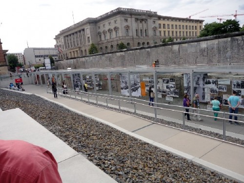
The propaganda was fierce and Goebbels raised it to new levels with radio, posters, rallies, flags, and parades. While the Topographies of Terror installation within the building focus on the three Nazi agencies and their victims, the photographs and texts outside document the Nazi activity in the Weimar Republic a few years before 1933 as the Nazis were coming to power. The presence of this segment of the Wall as background adds another dimension. It reminds us of the time—from 1961 to 1989—when the people of East Berlin were terrorized by the Stasi in order to dissuade anyone from escaping to the West.
In Berlin, one cannot get away from all this history of the Nazi era. Signs in the subways and on the streets are constant reminders of the ways the Nazis squelched diversity, terrorized the Jews and Roma, and murdered whom they perceived as enemies. But this will be a subject for a later letter.