Why Design Now? At Cooper-Hewitt Museum
Design Museum's Triennial Confusing Again
By: Mark Favermann - May 15, 2010
National Design Triennial: Why Design Now?
On view May 14, 2010–January 9, 2011
At The Cooper-Hewitt National Design Museum
National Design Triennial: Why Design Now? The Catalogue
Published by the Cooper-Hewitt, National Design Museum; Softcover; 192pp; full color
Design is both a verb and a noun. It is about process, object or place. Sometimes it is about all three simultaneously. Broadly defined, design can be anything from clothing to skyscrapers, utensils to vehicles, furniture to machines. One defining feature of design is beauty sometimes informed by elegance, function, efficiency and quality of fabrication. Unfortunately, every three years, the Cooper-Hewitt Museum staff thinks design is an adjective or an adverb. Beauty-what is that?
Now don't get me wrong. I feel that all design exhibitions are worthwhile. There is a pent up demand for thoughtful, creative and thus aesthetically pleasing design. The third floor housing the architecture and design collections at the Museum of Modern Art is always filled with people. Last year's Bauhaus Show was a crowded masterpiece of an exhibit. When the Metropolitan Museum has a design show or one that includes design like the Machine Age exhibit of several years ago, the visitors came in droves. Like pizza, sex and supposedly golf, design exhibitions are never totally bad. Though often viewer-embracing, they are generally few and far between. Most could be better. This is particularly true of many of the Cooper-Hewitt's shows in general. The Cooper-Hewit's Triennials are something definitely worth seeing, though they could certainly be much better.
The problem with encyclopedic design shows is the danger of trying to do too much with too little content or trying to do too little with too much material. Three approaches to design shows make them less than satisfactory. The first is the science fair approach which stresses technology over aesthetics both in the object shown and how it was designed, fabricated and/or used. The second is the furniture showroom approach that exhibits or rather displays furniture or smaller objects as if they were for sale in a furniture showroom. A couple of years ago, I criticized a version of the third Triennial at Boston's Institute of Contemporary Art because the show's designer rejoiced in the notion that he based the presentation on IKEA's warehouse with it too high shelves. The third is the trade show approach that thematically tries to make a strong sales pitch via a highly focused visual and overly elaborate label narrative.
Unfortunately, the Cooper-Hewitt's approach to this Triennial is a little of all three approaches. Certainly, the venue itself, the old Carnegie Mansion environment, is a difficult space in which to display anything. But, the curatorial staff has to take responsibility for the lack of visual cohesion and at times abrupt awkwardness of the exhibit, the over-explanation of some of the captions which frequently are too low to the ground, the pedantic nature of object descriptions and even the choice of objects shown in terms of innovation, scale or quality.
According to the Cooper-Hewitt, the Triennial program seeks out and presents the most innovative designs at the center of contemporary culture. Begun in 2000, this is the fourth exhibition in the series. This misnamed National Design Triennial suggests that it explores the work of designers addressing human and environmental problems across many fields of design practice, from architecture and products to fashion, graphics, new media, and landscapes. Old standby Cooper-Hewitt curator Ellen Lupton, who has been too long too prominently involved in each of the previous and current Triennials, along with Cara McCarty, Matilda McQuaid, and Cynthia Smith are said to be presenting the best experimental projects and emerging ideas for the period between 2006 and 2009. The objects and projects presented inform the notion of sustainability and energy-efficiency along with social issue problem-solving, the rather stretched theme of this Triennial. It is design with a conscience not necessarily with an aesthetic.
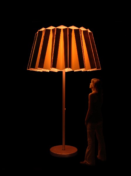
Why Design Now? is ambitiously and ambiguously divided into eight parts. This division adds more obscurity to the threads of the show. The parts are Energy, Mobility, Community, Materials, Prosperity, Health, Communication and Simplicity. Certainly there are too many categories and several could have been more prescriptively and therefore better descriptively combined. There are just too many themes not connected and not anchoring the exhibition. There are also two competing visual themes that add to the confusion. The first is some sort of funky, folk art approach that deals with homey and homely objects and projects. These include Greg Holdsworth's Return to Sender Eco Casket, Tjord Boontje's Witches' Kitchen and Christien Meinderstma's Hanging Lamp. This is underscored by a visual style that is used to suggest "green" aesthetic and social values. This thematic aesthetic extends to the exhibition design itself. For labels and signs, a vinyl caption text is applied to rough honeycomb cardboard. Cinder blocks incased in fiberboard with steel tension cables stretching between them are used for separation and screening. Here a handwrought, earthy aesthetic suggests environmental responsibility and some sort of faux authenticity.
In counterpoint to this folksy green style is a series of projects rendered as Futureworld images. Here are urban and regional design visions of a future perfected without people. Technology as the answer to everyone's needs. These include IwamotoScott's HydroNet, a vision of San Francisco's power grid distribution in 2108, a rendering of Masdar Development--an Abu Dhabi city to be built from the ground up as the first zero-waste city in the world, and a solar and wind powered cargo carrier by Wallenus Wilhelmsen Logistics, E/S Orcelle Cargo Carrier. The future seems very cold and inhumanly rendered here.
None of the Triennials have ever dealt particularly well with architecture either. The scale is always odd, the models are not quite demonstrative enough and images/photographs are generally flat. This is true in the Community area with this Triennial's architecturally oriented projects as well. Structures seem less than comfortable, often smugly confident of their form underscoring great function. The other weak area has always been graphics, referred to as Communications. These elements are usually eccentric, edgy and/or simply quirky. Last Triennial, there was a major display of a subtly color coded prescription drug system for Target Stores. No thought was given to the fact that about 30% of all men are color blind. In this Triennial there is a community brochure/poster called Vendor Power! that looks like a graphic novel. The problem here is that it is so dense with so many languages, and the font is so small that many of its audience will give up reading it. The designers claim that the proliferation of symbols aid the non-English readers. At best it is a puzzle to decipher; at worst, it is just irritating and nonfunctional.
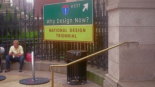
Environmental graphic designer Don Meeker has been working on National Park Service and highway signs for decades. His most recent creative contribution to signage is a font called ClearviewHwy. It is a system to allow older drivers and others with visual contrast issues to better read signs. The signs outside the Cooper-Hewitt Museum announcing the Triennial are done in this way. Unfortunately, the explanation of the process in the exhibit is done in a graduate school pedantic display. Again, the curators have gotten in their own way. Academic research has a limited layman appeal. It would have been much clearer to just compare a piece of an old sign with a piece of a new one.
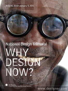
The pieces that deal with Health or social betterment are often the most human in feel and provocation. One in particular is AdSpecs. The World Health Organization (WHO) estimates that over half a billion people around the world need vision correction, but have minimal access to trained eye-care specialists and affordable eyeglasses. The majority of these people live in the developing world. The educational and economic impact of uncorrected vision is profound, limiting the ability to read, write, learn and work. In 1996, Joshua Silver, a physicist at Oxford University, created AdSpecs offering low-cost corrective eyewear to underserved patients. This design allows individuals to fill their own prescription without the need for expensive optical equipment. In 2007, he added a lens power scale. This important feature allows a user to know their glasses prescription.
The glasses’ technology is simple: as the curve of the lens changes, so does its refractive power. Silver created fluid-filled lenses—a clear, circular sac of silicone oil, which has a high refractive index. It is sandwiched between two clear and durable plastic membranes. The lenses are connected to a tube and a small syringe fitted with a dial, which wearers use to adjust the amount of liquid in each sac, custom forming each lens’s curvature to their prescription. Once adjusted, the sacs are sealed off with a small valve and the syringes are removed. Currently priced at $19 a pair, the glasses demonstrate how a low-tech solution can bring costs down and allow for easy access to a health device. This project is miracle-like.
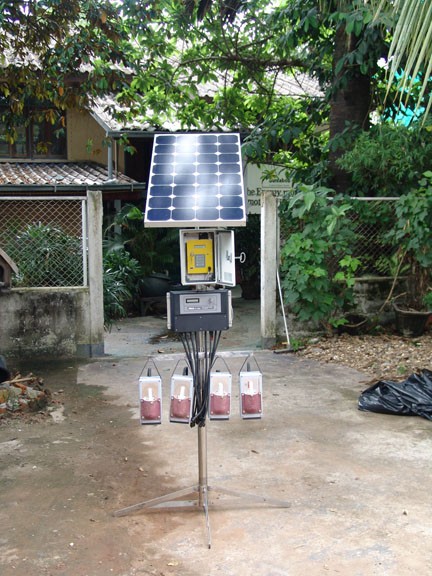
Designed by Nishan Disanayake from Sri Lanka and Simon Henschel and Egbert Gerber from Germany for a Laotian energy firm, a solar rechargeable battery lantern provides a safe, competitive electrical lighting alternative to the conventional use of kerosene by reducing greenhouse gases and offsetting fossil fuels. It provides a service-oriented solution for rural electrification. Villagers rent these portable, rechargeable lanterns from a solar charging station set up in the center of the village. There are microeconomic opportunities as well. The stations are rented by village entrepreneurs, who receive technical assistance and training but undertake the operation and management and fostering a sense of ownership.
Each of these awkward looking lanterns has an embedded microprocessor, an "identification” tag that monitors and safeguards its battery. During recharging, the central station collects data on the use and status of the lantern. The data are analyzed to ensure high efficiency of all equipment and for reliable carbon trading. These rather ugly lanterns are also being used in villages in Afghanistan and Uganda. Though there are other examples of homely, rather inelegant projects throughout the Why Design Now?exhibit, none are any less visually appealing than this project. The curators were more in love with the process rather than the visual and aesthetic quality of this science fair looking technology.
Though there are more projects and objects shown in this Triennial than any previous one (134), several of the projects displayed seem slighter and less meaningful. Less here is just less. I always thought that this exhibit was about actual objects, products and systems in use. Here there are too many projects and objects that are in conceptual or prototypical stages.
The transportation projects seem to be the worst examples of this Epcot futurism approach. A large model train of France's newest high speed passenger train concept was set on a pedestal. As our American Acella Express trains along the Washington-Boston corridor travel at about half the speed of this, it would have been nice to get a sense of the difference and potential for technological improvement. Wouldn't it have been cool to have a video of looking out the window of this new train technology?But, the curators chose a static model.
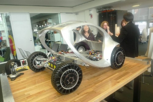
An even more egregious example of this was the City Car Project by the late architect/futurist William Mitchell's Smart Cities Lab at the Media Lab at MIT. There is a half scale model in the exhibit that gives no true visual relationship to the scale or other cool things about this futuristic vehicle. There are no working models of this folding concept car, though there has been a lot of drum-beating and publicity for it. The actual size of the vehicle will be roughly the footprint (carprint?) of the Smart Car, about 9 feet long. The strongest idea about the City Car is they will fold-up and take up much less space on the street. The car's energy will come from batteries located in their wheel hubs that will restore energy by driving the vehicles. Pretty neat. Left out of the exhibit are two other City Car products that will go to market perhaps years ahead of the car, a motor bike and a scooter. They too have the wheel-enclosed batteries. Were the curators aware of the two other smaller vehicles? Or did their rather inelegant folding bike choice negate showing real innovation?
Another strange case in point is the show's catalogue. This exhibition catalogue offers a comprehensive overview of the designers and works featured in Why Design Now? Essays are included by Triennially ubiquitous Ellen Lupton, Cara McCarty, Matilda McQuaid, Cynthia Smith, with contributions by Andrea Lipps. It was designed by Michael Bierut of Pentagram. The Museum conducted a competition among seven printers in six countries for the most sustainable and affordable option for printing the book. The winner of the competition was Toppan, the only printer named to the Global 100 Most Sustainable Companies in the World.
Toppan is certified by the Forest Stewardship Council (FSC) as a Chain-of-Custody company, which means that every step in the printing process, from the transport of raw materials and the manufacturing to the shipping, has been certified to be environmentally friendly. The paper used for the book is FSC-certified Moorim paper made in South Korea. The soy-based inks, made by Toyo, a subsidiary of Toppan, is also much more ecologically viable than regular oil-based inks. Cooper-Hewitt has purchased carbon credits so that the entire process of printing of the book is “carbon-neutral.” What this actually means is questionable.
Is this a "national" American statement? What about the true costs of shipping the paper from Korea to Tokyo and then the completed catalogue from Tokyo to New York City. Did they come by a slow boat across the Pacific or a fast plane? Wouldn't it have been greener to do it in or around New York? It would have been better for the Cooper-Hewitt to work with an American company to encourage them to develop sustainable and affordable techniques. This would be setting an American standard. It would also be the creative economy encouraging the green economy. Oh well...Internationalism, Global design, carbon-neutral shipping 12,000 miles, thy name is Cooper-Hewitt Museum Triennial. It is time for others to be involved in this important design and thus economic and social issue conversation. Our national design debate needs to be joined by others, not directed by just a few of the usual suspects.
A lot of visitors have already seen the exhibition. Many more will be visiting over the next several months. Despite the many layers of criticism, the Cooper-Hewitt Museum's National Design Triennial Why Design Now? exhibit should be seen. It is design with a conscience. Perhaps the best aspects of this exhibition are the questions that it proposes and the promises not met?
