
The Emotion of Design
Why Does the Best Design Viscerally Connect To Us?
By: Mark Favermann - Apr 26, 2012


Aesthetic pleasure is difficult to define. This is the idea of visual enjoyment. Why we like things and don't like others is a human mystery that is wrapped in scientific or technological principles.
Environmental psychologists, human factors researchers, behavioral geographers, social ecologists and social anthropologists add to the technical understanding of human behavior in regard to our tastes and emotional connections. This is then applied to design for our environment, accessories and amenities.
But why some things literally and aesthetically hit the spot so-to-speak and others don't quite make it is not a clear set of scientific precepts. All designers wrestle with functionality and beauty, usefulness and charm. Our humanness, our own personal "taste" both primitive (inate without thought) and educated (trained) direct our choices and foster ownership of structures, furniture and other favorite objects.
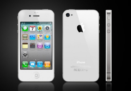
The late Steven Jobs said that great products were a "triumph of taste." He has been called a CEO of beauty who spoke about art, taste, soul and life enrichment. We greatly admire Apple's products for their functionality and aesthetics. Interestingly, Jobs' taste was not connected to originality, but instead to a derivative 20th Century minimalism.
The sensational Apple chief designer Sir Jonathan Ive acknowledges the debt to others (the great industrial designers like Raymond Lowey, Kem Weber, Norman Bel Geddes and Dieter Rams) as setting the standard for Apple's products. But the taste level brought to the Apple products is equisite and often incredably insightful.
Apple's designers understood the appeal of elegance of form, color, materiality and physical touch. Visual aesthetics were not enough. Each new Apple product builds on this concept of aesthetic pleasure coupled with functionality that results in the notion of what goes on hidden in the box, a seeming magical product.
Other great products that are "valued" by individuals are the icons of architecture, industrial design and package/graphic design. This can be documented since the Great Exposition of 1851, an event that can be considered the beginning of modern design.
But the notion of aesthetic pleasure goes beyond a pure objectivism. This is not some simple measurement of medium, function and message. It appears to be a great deal more both covert and overt.
There is a story about me and my family. When I was six, My family went on a vacation to Ohio to visit my uncle. We went to see the Cleveland Museum of Art. As we walked from gallery to gallery, suddenly I glanced into a room full of large Renaissance paintings. I refused to go into the room. I had a visceral reaction to a particular painting. My mother walked over to the painting and read that the title was something about death.
Thirty years later on a trip to France, a similar feeling came to me at Chartres Cathedral. I walked into the old church's vestibule and immediately felt that I had to leave. A physically ill feeling came over me as I took a few steps into the great cathedral. I quickly walked out into the cold rain of the day.
Though I did get to appreciate the ancient workmanship on the facades, I missed the interior centuries old French High Gothic architectural features. But, I really was not able to thoroughly visit the inner space. Somehow, I just couldn't. Significantly, my visit to Paris' Notre Dame Cathedral the year before went without a hitch. I even trecked up the stairs to the top to photograph the gargoyles.
Was my highly visceral response to Chartres emotional or physical or both? And why did this happen? It is not clear. Reacting to a space is not unusual, but reacting so strongly to a space is. Perhaps, it is like some people who fear heights and others are excited by them. Similarly, claustrophobic feelings in tight spaces, caves, etc. cause some people to not like windowless rooms, elevators, etc.
Spatial and object reactions both positive and negative are aspects of aesthetic satisfaction or emotional response to a design configuration in some cases environmental or even elemental.
Almost every man over the age of 40 is enamored by a special car, the Aston-Martin, DB series. They only build a couple of hundred or so a year. Sleekly elegant, compact without being compressed or squashed, they may be the perfect sports car. We know it as one of James Bond's earliest vehicals. It is cool and emotionally charged. We literally feel good looking at it. And in some cases, coveting it.
It is also quite costly. Few can afford to own one. They cost between $122,000 and $300,000 depending on which version. This cost, value, rariety, etc. underscores prestige and brand appeal. How sexy!
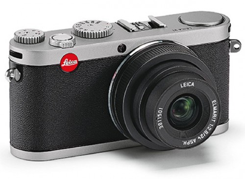
There are many other less expensive prestigous items whose various brands underscore prestige and desireability as well. These are emotionally invested objects of desire as well. A good example is the Leica Camera Company. Their products have been among the best cameras with the best lens systems ever made. Again, quite expensive, elegantly made and highly desireable.
Geometry seems to be a major aspect of the transmittal of design emotion. Minimalism in product design is about the elegant simplification of form. Primary shapes define the object or the structure. Thus, the best simple geometric forms are eloquently visually shape-derived.
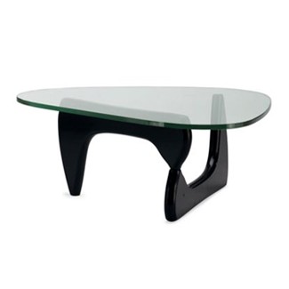
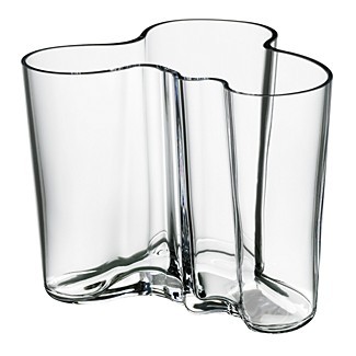
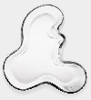
These shapes are not only rectilinear but also curvilinear. An example of the purest curved shape is the flowing organic Alva Alto Vase that architect/designer created in 1937. The 1950s Eames Lounge Chair makes an inviting curving presence as well. Noguchi's 1948 living room table is organically appealing as well. Each of these are still in production and are highly desireable today.
The Noguchi Table is said to conceal nothing and reveal everything about the nature of simplicity. Two simple, smoothly organic shaped pieces interlock to form a tripod that supports a .75" thick top of transparent glass. Here transparency leads to desireability. Other products' hidden mystery (like Apple products, Leica cameras and Aston-Martin cars) compels their attractiveness and appeal. The magic in the object makes them emotionally magnetic.
In recent decades, many designers have tried to create definitive visually exciting teapots. During the Bauhaus period, an elegant tea and coffee set was designed by Marianne Brandt in 1924. Only one complete set, the prototype is known to exist. Several examples of great tea pot designs are in major museums around the world, including the Museum of Modern Art and the Metropolitan Museum in New York.
Marianne Brandt's tea pot strictly follows the formal principles of the Bauhaus school. Circle, globe and square are the basic forms of the construction. It is a design icon. Another iconic teapot is industrial designer Richard Sapper's 1983 Whistle Teapot. The metal whistle has a strong geometric form.
In 1985, Michael Graves created the Bird Whistle Teapot, an object of great whimsy. The Post Modern architect designed a post modern visual statement adding the "bird" ornament to the rather standard shape of the chrome pot. Of course the bird sings when the water boils. This is a wildly popular kitchen object.
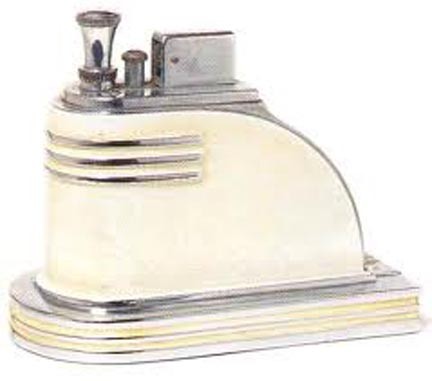
Streamline is a variation of organic geometrical shapes. During the late 20s and 30s, designers used this styling device to convey motion while standing and as a futuristic forward visual quality. One of the most iconic lighters of the period is the Ronson Zephyr. Unfortunately, the designers for Ronson Lighters are unknown.
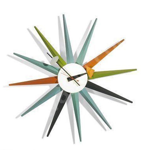
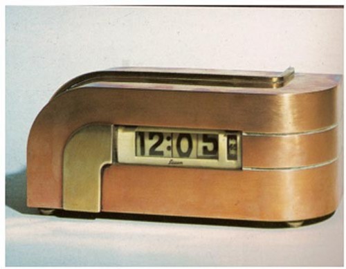
An iconic streamlined clock was created by designer Kem Weber. He designed the interiors of the Walt Disney studios in 1930s and many social comedy film interiors. Also called Zephyr, this clock is a streamline early digital beautiful object. In the fifties designer George Nelson created a series of clocks using the notion of parts of the compass, or rays of the sun. Now technically upgraded (with a hidden battery and no exposed wiring) and being sold again, Nelson's 1952 Spike Clock brings rectilinear geometry to is basic parts of lines in space.
Nelson wrote well about his concepts of design. Several others, both good and bad, also have tried to convey theories of design and architecture in written form. Among the best are the theories of Bauhaus-trained Victor Papanek. His Design for the Real World (1972) dismissed much of design as rather worthless and admonished designers to be practical as well as to address the needs of poorer nations, the disabled, and the aging. But great design is not just about pure function.
If there was a specific formula to create desireability, appeal, positive emotional responses and even aesthetic pleasure, all design professionals would understand this. All consumer and luxury products would inculcate this. This is just not true.
However, there are human aspects that embrace the most appealing and the most desireable of objects, structures or elements. Innately, from a very early age, we seem to know what we like, to what we are attracted. Apparently, it is this emotion of design that is viscerally translated by a sense of visual, physical and even a nondefineable sense of highly compelling magical pleasure.