Designing Wayfinding For Accessibility
Compliance With ADA Regulations By Design
By: Mark Favermann - Apr 23, 2010
My good friend and even better designer Michael Sand says that we are all disabled at one time or another. The ADA (The Americans for Disabled Act) rules, regulations and laws are a major aspect of universal design. These are Federal regulations that are interpreted in building codes by cities, towns and states in the United States. Universal design is about making everything accessible to everyone no matter what their disability or physical challenge. Perhaps surprisingly, the United States is far more sensitive and advanced in regard to accessibility than other nations.
Today, architects, interior designers, industrial designers and environmental graphic designers are all involved in issues of universal design. The two major design themes of the 21st Century are sustainability and accessibility. The Society of Environmental Graphic Design (SEGD), an international professional design organization, has been involved in guiding the design community on ADA compliance issues on wayfinding and signage for more than two decades. This mandate dates from well before the Americans with Disabilities Act passed Congress and was signed into law by the first President Bush in 1990.
In the ensuing years, SEGD has held numerous educational workshops and produced a body of educational materials that have helped professionals in the EGD community guide their projects toward ADA compliance. Members of SEGD’s ADA Committee have closely monitored ADA compliance issues on the federal and state levels. Their expertise has helped to shape reasonable and implementable legislation. In 2008, I was appointed to this seven person committee.
The first of SEGD’s continuing series of ADA White Papers was published in 1992. The SEGD ADA White Paper Update 2007: Guidelines, Best Practices, and Innovation for Signs for the Blind and Visually Impaired, includes a clear definition of what is the ADA. It included a discussion of typography for the Blind as well as typography for the limited sighted, positioning of of Tactile text and Braille on Signs, Color Contrast, glare and finish, Braille and new technical innovations. There is a thoughtful state-by-state guidelines review including California's quirky Title 24 and other useful studies and techniques.
Recently, I was part of a conference/workshop on Canadian disability concerns in Toronto. My trip to Toronto was exhausting but meaningful.
On a Thursday evening, I was nearly two hours late due to a circuitous trip and lateness of the crew to reach the plane at Dulles, yes Dulles. My trip was Boston to Toronto via Dulles (Washington, D.C.). Don't ask me why, but apparently that kept the trip ticket price reasonable. It could have been worse. I could have been traveling to Europe during the Icelandic volcano eruption. But it was a bit ironic that traveling to a conference on accessibility was seemingly so inaccessible. I requested a 6 AM wake-up call at the hotel because my ride to the workshop venue, the Canadian National Institute for the Blind (CNIB) was a bit outside downtown Toronto. I was eventually picked-up about 7:20 by the conference organizers. About 20 minutes later, we arrived at a state of the art facility with talking signs and appropriately modified environmental graphics. After a continental breakfast for the nearly 50 attendees, the meeting started at 9:30. Attendees included normally sighted, partially sighted and blind individuals.
The major problematic issue in Canada is that the provinces are more like countries than states. Only Ontario has standards dealing with universal access. Therefore, unlike the US (which has had a national law since 1990), Canada as a whole has a very inconsistent country-wide, province to province approach. Europe is very behind the US as well.
The workshop was to discuss the existing Ontario code, Best Practices in the US, and examples of good and bad applications of wayfinding and navigation for people with disabilities. The project was sponsored by the Society of Environmental Graphic Design, its Toronto chapter, and a number of Canadian sign and architectural product fabricators. By the way, SEGD is a misnamed group that deals with a range of design skills, techniques and technologies including, branding, wayfinding, signage, interpretive elements (like displays). It entails exhibits and dynamic environments like Times Square and touchscreen elements. The president of SEGD is a Canadian designer.
Personally, when I was working as a consultant to the MBTA, Boston's mass transit system, I developed expertise in the ADA compliance field. Eventually I was certified as one of the very few Leadership Wayfinding Accessibility design professionals in the United States. This is why I am asked to lead workshops or give lectures.
In Toronto I spoke on Best Practices, the journey or experience of the customer or passenger, new and emerging technologies. The audience was quite receptive and knowledgeable.
A number of prominent Canadian designers participated. Canada has a number of unique issues. Part of the Canadian problem is the fact that they are a bilingual country, so everything is in English and French (of course Quebec emphasizes French over English and the other provinces do the opposite). This applies to signs and wayfinding as well.
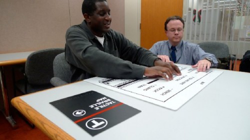
The effort in universal access is to include Braille as well as tactile letters. This has several problems: first there are two types of Braille, Type 1 (totally written out) and Type 2 (shorthand or contracted words). English can be written in both types with Type 2 now being preferred, French can only be written in Type 1. Added to this is the problem of double tactile words which must be added to visible words in both languages. The result could be an overly complicated mess. One way to get around it is to use more symbols and numbers, but they have their limitations. Adding to the situation is that initially the effort was directed at totally blind people. However, one size fits all really does not work.
Estimates of actual Braille users is from 3% to 8% of the legally blind. A bit of the tail wagging the dog here. My Dad would have never learned Braille in the 10 years that he was legally blind at the end of his life. But law is the law, and design must follow its guidelines.
In the US with the aging Baby Boomer population, concern is being shown for individuals with vision problems of varying degrees including contrast, glare, letter size and placement. The US's initial ADA program came out of vocal and activist groups, the blind being perhaps the strongest and most vocal. The second strongest group was the wheelchair organizations. The hard of hearing were also "heard from" as well as were the Little People of America (who want everything more reachable by them).
The militancy of these groups has resulted in many real and threatened US lawsuits. Canada is much less litigious, but often awards money settlements to individuals and groups claiming stress or discrimination. There are many issues in all of this. Perhaps understandably, people with limps, crutches and canes do not have activist groups, therefore slopes and pathways do not accomidate them (us) as well as they do wheelchairs.
Strangely, or maybe not so strangely, California has developed another form of Braille, California Braille which is a spread out variation of Type 2. They also require that Men's Rooms symbols be on a triangle and Ladies' Room symbols on a circle. Various other details are different as well. But, it is California. No other states have followed their Title 24.
It should be noted that the US is ahead of the rest of the world in terms of universal design laws most probably because of its very litigous nature. Activist groups both sue and threaten to sue to get their way (literally). Many transit authorities have been sued including the MBTA in Massachusetts as well as major health facilities like Massachusetts General Hospital.
The Canadian conference ended not with a sigh of despair but a cheer of hope. The hope of the designers and fabricators was of a cooperative effort to achieve the best results for a Canadian equivalency to the American ADA. The Canadian designers felt that they can learn from the Best Practices of the US and creatively work out their own Canadian problems thoughtfully and sensitively. When this will happen is now just conjecture. I for one am willing to help.
