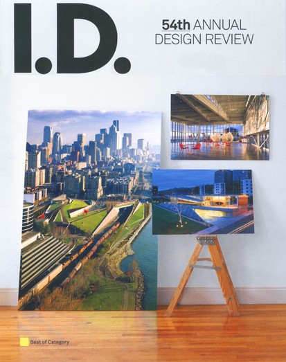
I.D. Magazine Dead At 55
Influential Design Publication Is Terminated
By: Mark Favermann - Feb 27, 2010
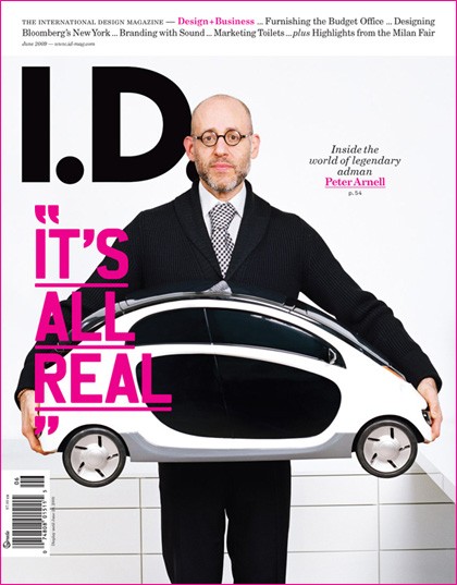
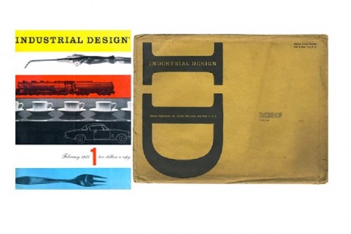
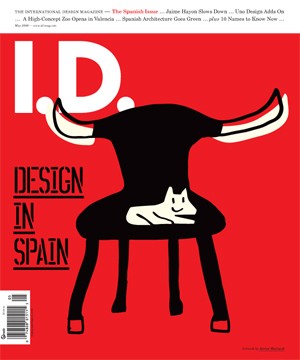
In recent years, many print (traditional) newspapers and magazines have gone out of business. Old style journalism is in a tough place. A once prominent, but fading magazine was put to final rest recently: I.D. Magazine (1954-2009). At its beginning, it was one of the building blocks of the profession of modern industrial design. Prominent designers were both showcased and even wrote for the publication in the 1950s and 1960s like Andy Warhol (illustrations) and architect/designer George Nelson (articles). Later even graphic designer Bruce Mau created a new layout in the early '90s for the magazine. But in the last several years, it became trendy without really serious or innovative content, outdated by the web and often cute without being clever. Design should never be just cute.Former staff members have blamed an uninterested and unsophisticated Midwestern (I.D. was always highly New York City-centric) publisher, the Great Recession, 9/11's shutting down of several years of real creativity, diminishing advertising revenues, changing readership trends, lack of keeping up with the internet journalism and number of other things to make themselves feel better. The magazine claimed an at best monthly readership of around 30,000, but that seems rather high and probably counted libraries and universities in some sort of weighted way. The newsstand cost was quite pricey for undervalued designers and even poorer students to fork over each month. Readership significantly fell off in the 00s. But, could the cause of its demise have been the editors and writers themselves that led to its downfall and eventual closure?
Writing about design is not easy. This type of writing is about being critical, understanding historical precedence, knowledge of design fundamentals, integrating trends of popular culture and sometimes expressing a learned if controversial opinion. Design magazines like art magazines have good, bad and much mediocre in them. When they inform, explain and even educate, they are doing their job well. When they do not, well, they aren't worth very much as publications. In the last three decades, the various design disciplines' (architecture, industrial, graphic, etc.) involvement and intermeshing with evolving technologies has made it difficult to peel the onion to uncover what was good design and what was clearly not. Great technology does not necessarily mean great design. It was and has been an aesthetically bewildering time. I.D. clearly suffered from this.
Over this 30 year period, various publications have attempted to explain or at least report what design was about. More often than not, technical jargon or winking, nudging and finessing took the place of critical observation and true design discourse. Genuflecting to emerging technology as the next great thing in design as opposed to seeing technology as increasingly sophisticated tools and not being critical enough of unfulfilled promises were mistakes. The computer, the internet and all that these meant as part of an emerging technological tool box caused cultural turmoil in the design fields. This was attempted to be reflected by publications in the 90s and 00s. Trying too hard to be too trendy eventually leads to loss of interest by readers.
In its later decades, I.D. Magazine was one of the publications that suffered from this. The symptoms were the overuse of technical jargon being awkwardly pronounced by Silicon Valley and its cousins and the shear delight it showed in the newest and perhaps untested software and systems approaches. Aesthetics seemed to be often left out in favor of a conceptual compost of neither good design, creative art or clear functionality. The disease was about promising utopia and delivering just another tool and most often not a real product. This wasn't just true of I.D., but I.D. caught the disease severely, and the disease was eventually terminal.
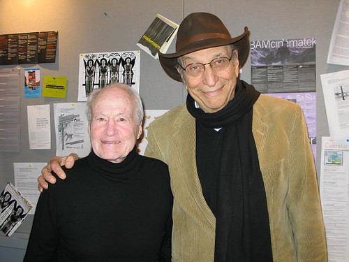
The "eminence gris" of I.D., Ralph Caplan, now 85, was a longtime editor, reporter and contributor. He rode the post WWII design wave and acted as the Boswell to many of the emerging designers of that period from the mid50s well into the 70s and early 80s. He was/is a friend of that generation of design stars. I.D. assisted in their careers and they assisted the magazine by having their work spotlighted or in portfolio. Caplan also ingratiated himself to the corporations that hired his friends and subjects of many of his articles. He became a longtime consultant to a few of them. Objectivity be damned, but who was there to judge? New York designers appeared to be one big happy family. Caplan was an adopted brother.
Thus, Caplan built a magazine that strategically looked at design and the corporations, vendors and fabricators who seemed to care about quality design. This period was a bit of a golden age of design. New design trends seemed to explode culturally in the 60s and 70s. In certain ways, popular culture and all that meant was personified by design. Culture, art and design were all having their 20th Century dots connected. Star designers were being recognized. Design became a popularly accepted art form. Innovations happened the old fashioned way, one at a time and by hand. This was decades before colleges and universities started pumping out a lot of technically skillful, but often aesthetically-challenged design school graduates. However, that is not to say that everything created in that period was wonderful or full of genius, because it was not. Ralph Caplan was a very good, clearly spoken writer. Under Caplan, I.D. fostered design's new found popularity.
The 80s were years of worldwide corporate growth. The magazine grew as well. It mirrored the ups and downs of the economy and reflected fashion, style and trends. For most of the rocking 90s, former I.D. editor in chief Chee Pearlman tried to run the magazine as a niche publication to look at and discuss the rapidly shifting world of design/business/technology/environment. This was a broad overly ambitious sweep. I.D. always seemed to have a focus issue: Was it about product design? design in general? environmental issues? or world culture through the prism of New York City, the then center of the universe? All of the above? Also, it was hard to sell ad space based on this lack of focus.
During that period, other magazines began to blossom that seemed to speak more directly to the high tech and its emerging corporate culture like Wired and Fast Company. Both of these seemed fresh and much more clearly connected to the new technologically driven marketplace than I.D. Yet, each was often written in techno-babble, corporatespeak and often just insider jargon. Unfortunately, I.D.' s Pearlman, other editors and writers thought this was hip and followed in this direction with articles and columns that often needed translations to English. Perhaps to demonstrate cleverness and cultural awareness, the writing in I.D. became often dense and obscured. Software and trendy technological systems topics took the place of good design subjects. Pearlman's reach was greater than her grasp. I.D.'s core readership began to erode. This was not so cool.
Another magazine, Dwell, took on domestic and consumer issues, projects and products. Still another magazine, Metropolis, began as primarily architectural and urban design oriented, but soon added design trends and products developing a more understandable contemporary design resonance. It seems to be thriving. Instead of focusing on I.D.'s trump card, real design with an aesthetic foundation, I.D. competed badly with the other three trying to technospeak its way into the emerging culture. I.D. just became less enticing, design product precious and less relevant.
Because Pearlmann herself and her writers were surprised or shocked by what was happening in this highly techno-charged world, they figured that I.D.'s readers would be as well. Some did, perhaps mostly students and academics, but this notion turned out to be a long-term self-deluding mistake. The "shock of the new" gets a bit old unless there is some good design attached to it in a design magazine. The magazine seemed to champion manipulation over design, concepts over content. Pearlman left I.D., and other less strong-willed editors followed in the 00s. The magazine was more or less rejected as less than stimulating by both older and younger designers seeing it as an often dated and an oddly establishment or corporate publication. The publishers were paying attention and eventually just shut it down. It is too bad as I.D. could have stayed a contender in different, perhaps more thoughtful hands. Except for the former staff, there is not a lot of tearing of garments and gnashing of teeth about its demise.
An odd thing is that for such a trendy future-oriented publication, it never mastered online publication methods. Thus, I.D. was interactively overtaken by more flexible and timely blogs and online magazines that were in many cases (like this one) free. I.D. did not keep up with the times.
Underfunded for many years as ad revenues spun downward, the most profitable aspect of the magazine was the Annual Design Awards. The oldest design awards program for products in existence, it is estimated that they generated between $200, 000 and $300,000 a year for the publishers. This was not added to the bottom line of the publication, but added to a competition division. The publishers, F+W, have decided to continue the Annual even without the magazine. It will be interesting to see if the same prestige will be assumed for the Annual awards in the future. We will have to wait and see in these financially challenged times if there continues to be high participation in this awards program. The actual meaning of design awards in the 21st Century is another topic for another day.
After struggling for years, I.D. Magazine outlived its relevance. RIP.

